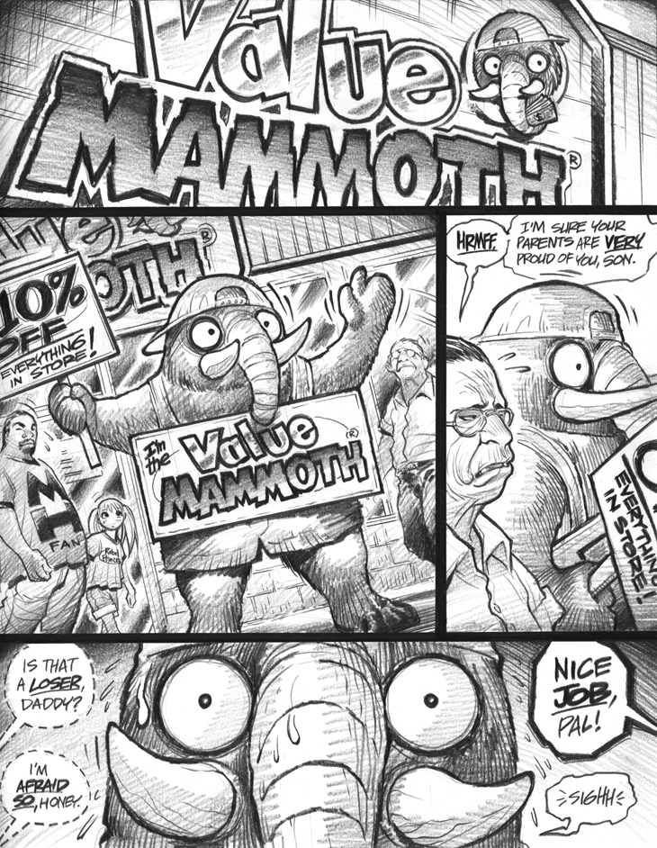
Once again, looking at the less-than-ideal signage in panels 1 and 2, I really do sometimes wish that I could’ve hired an actual letterer for this book. Ah, but then I remember that hand-lettering directly on the page usually saves me copious amounts of worktime, as every word balloon taking up space in a panel means less background detail for me to draw. And then I remember further that I couldn’t really afford to hire a separate letterer for the book, regardless of how crappy my Value Mammoth signage might look.
Must admit that the Value Mammoth mascot suit still amuses me to no end, perhaps because the idea of a furry wearing “jorts” is inherently entertaining to me. I also rather like the design of the elderly fellow in panels 2 and 3; sadly, this suggests to me that I might have cribbed his look from the work of another artist. If so, my apologies to whichever forgotten artist I might be “homaging,” here.

