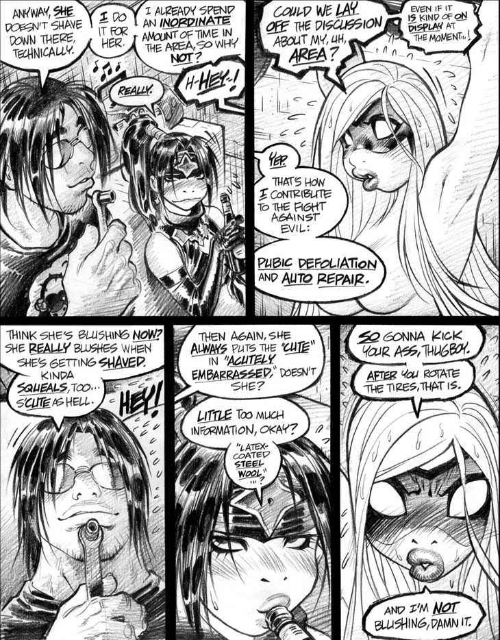
Not much springs to mind regarding this particular Empowered page, so I might as well go shooting off on a tangential topic previously addressed in a commentary from several weeks ago: comic-book emphasis lettering! Or, to use the specific combination of bolded and underlined fonts I use for this series, emphasis lettering! (As mentioned earlier, I use that combo mainly because I can’t reliably sustain italicized lettering—and also because bolded underlining was familiar to me from the standard comic-book scripting format.)
One recent commenter dismissed my much-beloved emphasis lettering as not being “what people sound like in real life.” Well, my condolences to the commenter, then, since the poor fellow apparently abides in a dry, toneless hellscape where everyone speaks in a flat, expressionless, robotic, inflection-free monotone. Sarcasm aside, emphasis lettering is an stylistic idiosyncrasy that works uniquely well in the comics medium, and not so well outside of it; I wouldn’t really care to read prose dialogue formatted with heavy emphasis use, but am perfectly comfortable with such usage in a comics format.
To me, the dialogue I script has a very, very specific rhythm and accentuation, which emphasis lettering defines and delineates with perfect clarity. I’ve heard some folks claim that emphasis in dialogue detracts from and restricts their reading experience, but I must admit that I find that perspective unrelatable, if not outright nonsensical. That would certainly be a relevant criticism from, say, actors reading a play’s script, as emphasis lettering would straitjacket them to a particular line reading—but I fail to see how that concept applies to someone who’s just reading a comic. It is the writer’s job, after all, to convey a story clearly—though of course some disagree with the “clearly” part—and dialogue emphasis is just another useful element in his or her narrative toolbox.
Some critics bleat, “Hey, you rarely see emphasis lettering in a novel, do you?” Well, so what? You’re reading a comic, not a prose piece. (Okay, fine, at this moment you actually are reading a prose piece, but let’s ignore that.) Stick to words without pictures if your narrow little mind can’t handle the more idiosyncratic storytelling techniques unique to comics, okay? SPOILER ALERT: We do many, many things in the comics medium that are likewise not a part of the prose-novel format.
Q: What are the two 80s-era Western comics whose writing was most responsible for me blundering into this medium? A: Howard Chaykin’s American Flagg! and Alan Moore’s Swamp Thing—and both writers used emphasis lettering freely, a fact which was no doubt highly influential in my approach to dialogue. Do the sneering critics of emphasis lettering fancy themselves to be more knowledgable about what does and does not work in comics dialogue than Chaykin and Moore at the very height of their powers? I submit that no, sir or madam, you certainly do not—and neither do I, for that matter.
(Side note on Alan Moore: A few months back, I read Batman: The Killing Joke again, presumably for the last time in my lifespan; no need to see Barbara Gordon standing there and getting shot like a big ol’ dummy again, I think. Anyhoo, I was amused by the one thing that really struck me during this final rereading: Damn, but Moore uses a boatload of emphasis lettering in The Killing Joke’s dialogue. In fact, I think that he might have even used—brace yourself, here—too much emphasis lettering, a thought that borders on the heretical for a diehard emphasis aficionado such as myself.)
Jeez, just cranked out 6 g-d paragraphs on the topic, and I’m still not finished with it. Well, I’ll clearly have to revisit this topic in a future commentary. Or should I say, revisit this topic?
-Adam Warren


